Update: New TurfNet Look Is Even Better On Devices
Last fall I provided a tutorial on using TurfNet from devices like smartphones and tablets. It makes it very easy to view things like the Forum, Jobs Board, and more all from any device. This month, Peter and the team at TurfNet have launched a new version of the site which looks great, and it works even better on mobile devices. While the basics of my previous full tutorial (read here) are the same, there are a few changes to the navigation and getting to areas of the site. So, here's a few tips on using the new setup.
ADDING TO YOUR DEVICE
This process remains the same as with any website. You can 'Add to Home Screen' and create a new app icon for the website on your device. Select the middle 'share' button with the arrow pointing out of the box. This will bring up a menu where you can select the 'Add to Home Screen' button. Now you can launch the TurfNet app from your home screen. When you do this, it will basically open up Safari to the TurfNet home page. Once there, you can view the content on the main page or choose to navigate to other pages.
NAVIGATION CHANGES
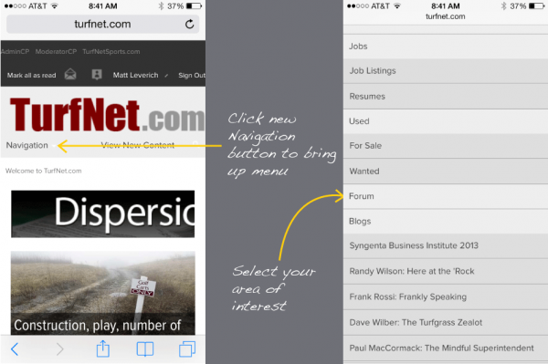
Instead of the old 'square' icon to get to page links, there is now a button called 'Navigation' that will bring up the list. If you select any areas that are members only, such as the Forum, you will be prompted to log in if this is your first visit from this device. But after this, you shouldn't ever have to log in again unless you delete your browsing history on your device.

FORUM USE
Once the Forum loads, the default page includes all Conferences or Topic Groups. From here you can then select a group and find an exact thread same as on a desktop, but the content is delivered in a format for mobile that is optimized. They really have done a great job in making it easy to read and send replies.
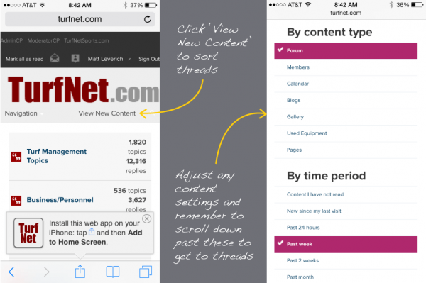
There is also a button at the top right of the default Forum page that says 'View New Content'. This will load all new/unread comments and threads in a single display, where you can then sort by time or type. This is how I view the Forum mostly, it's great to sort it by time to view the most recent threads all together. This is again another great improvement over the earlier version because you can adjust the settings for new content much easier.
One tip -- the settings for this new content show up at the top of the page, and the content loads below it. You need to scroll down past the settings info to get to the forum threads as it loads on the same page, where before it was separate.

OTHER SECTIONS
In addition to the forum, all of TurfNet.com is available. The new format for the Jobs Board is a big improvement that even quickly shows the starting pay for most jobs, it's a very nice upgrade to this heavily trafficked area of TurfNet. You can also keep up with the latest news and blogs like this one right in the Webapp, in a format that works great for mobile devices.
The setup is really easy and you can use this same process for other sites that interest you.


0 Comments
Recommended Comments
There are no comments to display.