The application email, & using a header image
This post is a quick and easy, yet very effective use of your application email for making an impact in your job application right at the start. First off, there are a two things you should know about sending your application email:
-
You should state your sincere interest in the club or company and mention why their organization is worthy of your interest. It almost always serves you well to flatter with a statement about them, instead of solely focusing on you. This is a great way to start off the application process.
- The content of your email should be very short, and your cover letter should never be included in the text of the email body. Why? Because your email will get forwarded to others and the text will get lost in the email chain for users down the line and make it more difficult for them to read it. You want to make it simple for them. Having the cover letter as its own file is perfect for this. It also allows the hiring person to download your documents and collate them into a report or folders much easier.
With those out of the way, here is a way to consistently get attention to your application email right away:
EMBED A HEADER IMAGE AT THE END OF THE EMAIL
This serves to showcase your brand right away, and hopefully a very professional look. You can hire a designer to do this for minimal cost. If you already have a website or portfolio, it's as simple as taking a screen capture of the home page with your name and image there.
The benefit of using this image is to have your email jump off the screen. Instead of only seeing text and links to websites or PDF files (never send Word docs, as they can be altered!), they see a visually pleasing picture of the golf course with your name typeset with it.
When I build career materials, I always use the same header layout (same font, title, style, image) across all platforms (resume, letter, website, portfolio) to create a unified brand for your career. So this same look is simply carried on to the header image for this email. I would not recommend using this image tip unless you have someone design it for you who knows what they are doing, otherwise it can have the opposite result and actually hurt your chances.
There are a few things to know to ensure it looks right:
- Use an email client like Mac Mail or Outlook, or a provider like MailChimp online. These clients can embed images directly in the body of the email through use of hidden HTML coding, just by uploading the image after a line of text in the email body. If you go to Gmail from a browser and try it, the image will not be embedded, it will just show as a small attachment.
- To embed the image, type out all the text of your email. Then under your name, leave a couple of blank lines and when the cursor is in that position, select the Attachment option and upload the header image. Then upload your application materials after the image so the user must scroll past it to get to them. This scroll is their initial look at your brand and sets up what is to come in your materials.
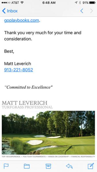
That's it! It even works for opening email on phones, and while the image isn't as big, it's still highly impactful on mobile where a lot of email is opened initially.
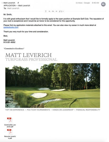
Here is a mockup I put together to show how it can look.
This is the entire email zoomed out:

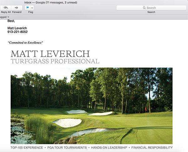
This is the normal view when scrolling:

This is from a phone:


0 Comments
Recommended Comments
There are no comments to display.