Adjusting Turf Resumes for the Mobile Age
I don’t have to tell any of you that smartphones have changed how we work each day, especially from out on the course. From chem/fert apps like Coverage, to Twitter and labor software, there have been vast improvements to the daily operation because of mobile devices.
It doesn’t just stop with our side of the industry. Any hiring person at a club or firm is now extremely likely to view your resume the first time from their phone while on the move. What does that mean? You had better be sure it looks good from a phone. There’s not currently a perfect solution for this without a personal website, but we at Playbooks are currently developing such a platform for resumes for those who don’t want a full website.
You had better be sure it looks good from a phone...
In the meantime, here are some key tips to at least make your resume a little better for mobile:
Save Your Resume as a PDF
I’ve said it before that sending your resume as a Word file is a terrible idea. Computers have different versions of Word and read the formatting differently every time. Margins, tabs, etc. can and will show up wrong, resulting in a resume that looks shoddily put together.
This holds true for phones too. A Word file opened from iOS or Android mail apps will reformat the text and the tabs, especially for bulleted files like resumes, resulting in jumbled and hard to read text.
Saving the file as a PDF ensures all formatting remains how you intended it. You can do this from most new versions of Word or through an online conversion tool.
No Columns, Big Text, and Watch Your Width
Since most people will be looking at their phone screen vertically, you want to avoid things like multiple columns that won’t read well. Columns are great for desktop websites and printed materials but do not translate well to phones. Get rid of them if you have them.
Following this thought more, you have to be careful on how wide your resume is. While you can’t format your resume file completely for phones, keeping the content width under 5 inches would be a good compromise.
You should also be sure that the font size is plenty big. Anything less than around 11pt is near impossible to read on phones. This leads to the next important tip…
Avoid the Wall of Text Resume
The mobile age has made attention spans shorter than ever. Your lengthy resume with dozens of bullet statements that are more like paragraphs just does not translate well anymore when you usually only have seconds for the hiring person to review your resume.
Try to keep text at less than 3 lines before a space, 2 lines is better.
Your lengthy resume with dozens of bullet statements that are more like paragraphs just does not translate well anymore...
Keep your bullets to 4 or less for each job you list. In fact, abandoning actual bullet points or hyphens is a good idea as they create formatting issues on phones anyway. Just list them as sentences without an indention or character to begin.
Don’t be afraid to use white space to help create separation between sections and jobs. It is well-known in the design world that white space works fantastic. Too much content causes a “glaze-over” effect.
Create Links for Contact Information
Since we use phones with fingers and not a mouse, it’s not easy to copy an email or phone number. Make sure that your phone number and email are formatted properly to be one-click actions on phones. This can be done from Word quite easily.
Also, be sure to make the contact information available at both the top and bottom of the resume so there isn’t a need to scroll all the way back up on a phone.
Test From Your Phone
A final tip is to send your email to yourself and open it on your phone. If you have a hard time reading it, so will the hiring person. Check the contact links as well.
Doing all these tips should result in an improved resume for the mobile age, yet not ideal.
A Look at a Better Way
As I mentioned at the beginning, there’s not a perfect solution without having a website that is responsive for any device. And even then, you still have to attached your resume as a file to the email when applying. Which means they might bypass the web link to your PDF file that isn’t formatted for phone very well.
As part of my service to clients, I have developed a way to create a resume that responds to device size so the resume reformats best for the screen, plus it can be attached as a file, solving both problems we covered and exponentially increasing your odds of a closer look.
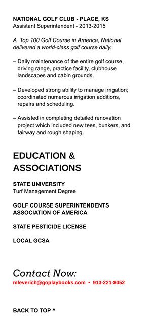
Here is an example of a fully formatted resume for phones, showing the last bit of content and the contact info, along with an anchor to take them back to the top for easy access. It also shows as a normal width file when opened from desktop.

I can do this coding manually for a certain amount of people but it still takes time so there are limits to the service obviously. We are working on creating an automated process for this so anyone can do it themselves from a webapp we create. More on this in the future, but if you are interested in the manual aspect be sure to let me know as hiring season is nearly upon us in the golf industry.
Best of luck on your next job opportunity.


2 Comments
Recommended Comments